Wednesday, 26 September 2012

Evaluation

Using our audience research that we have done on our short films that we have chosen for analysis and the results we got back from our questionnaire that we have created to find out more about what genre of films people like and informationon why they go and watch films. Here is our evaluation.

  • Looking at our questionnaire and our audience resaerch from YouTube we have decided that we would like to make our short film so that it targets a young audience, this is beacuse of the fact that most people that answered our questionnaire were between the ages of 16-18, and combined that with the audience research from YouTube there is a greater target audience for younger people watching short films. For our short film we would like to target people between the ages of 16-25, which is a bigger enough group of people that we would like to target and there is potentail that people between the ages of 16-25 want to see more short films.

  • Looking back at our questionnaire and our target audience that we gathered from YouTube we decided that we should target both males and females. This is becasue of the fact that by looking at our research that we have gathered, both genders enjoy watching films and they both genders enjoy watching short films as well, this can be seen by our research from YouTube because of the fact that most of the short films that we have chosen for analysis are very popular with both genders, so by saying our target audience is for both genders we will have a much greater target audience.

  • On the poster side of the short film that will have to create as part of our media coursework, we have decided to create a poster that is simple but also is very effective as well, just like the submarine film poster that we put in our questionnaire, we liked this idea becasue of the fact that the submarine film poster was the most popular film poster that we put down in our questionnaire. Even before the questionnaire we liked the idea of having a simple poster with the main character on it, and some effects with colour rather than having an over complicated poster that does not look as effective as a simple poster which looks even more effective than the complciated poster.

  • One of the questions in our questionnaire which has helped us to set the short film idea in stone is the question that asks people how many times they watch films per week, we were supprised by the answers becasue most people watched films 2-3 times per week and some even watch films ever day of the week, this tells that there is a current market for making films and even short films. This also tells us that there will be a target audience for the film as alot of people actually watch alot of films per week so there will always be an audience for the short film that we are going to make.
  • Another important results that we got from our questionniare was what attracts you to go and see a film. The main 50% of the results was for the cast of the film, but the second higest with 40%  was the plot of the film, This is really important for us because now we can focus on making sure that our plot for the short film is as good as it can be, and also that the plot of the short film can help to attract the audience members to the film has well, This means that we can concentrate on making sure our plot stands out from other short films with other plots that are similiar to our own. This is important for us as it will make our film stand out and attract the target audience that we want our short film to target.
Dan Davis

Similar media texts audience research

Signs

The first short that we actually have chosen for analysis was the short film "Signs". After completing the analysis of the short film "Signs", now the next step is to complete some similar media texts audience research. To find out which gender's watch the short film, the location where the short film is popular, and the age groups that enjoy watching the short film, we looked at the video/film distribution webiste YouTube. The short film "Signs", has been watched many people around the world but it is most popular in Mongolia, Russia and Singapore. The short film "Signs" is most popular with the male gender which is shown by the top demographics of the short film. The top demographics also show us the age groups that have watch the short film "Signs" the most, in this case males aged between 18-24 years old, male between the ages of 25-34 years old and finally males between the age of 35-44 years old. So basicaly it is popular between the ages of 18-44.

Reminiscence

The next short film that we have done audience research for is the short film "Reminiscence". We also used the video/film distributition site YouTube to aid us in our audience research. The top locations where people have watched this short film the most has been in the United States, Costa Rica and Austrailia. This tells us that people in these countires have enjoy watching this short film and that is why it is so popular in those countries. The short film "Reminiscene" is popular in both genders, but it is more popular with the male gender rather than the female gender, this also links in yet again with the top demographic which helps to show the ages of people who have watch the short film the most. The short film "Reminiscence", is popular with females between the ages of 45-54 years old, it is also popular with males between the ages of 18-24 years old, and it is also popular with males between the ages of 35-44 years old.

Thirst

Another short film that we have done audience research on is the short film "Thirst". To help us in our development in our target audience research we used the video/film distributing website YouTube, to help us to gain an idea of which gender of people enjoy watching the short film. Where in the world the short film is being watched and what age groups enjoy watching the short film. The short film "Thirst" is popular in India, Sri Lanka and Lithuania. Using the top demogrpahics of the video available to us on YouTube we have found out that the short film "Thirst" is most popular with the male gender, this might be because of the fact that the main character is a male and the story follows his life. Using the top demographic we can also find the ages of people who have watched the short film. For example the short film "Thirst" is popular with males between the ages of 25-34 years old, also with men between the ages of 35-44 and also with men between the ages of 45-54 years old.

The Plan

"The Plan" is another short film that we have used to do our target audience research on. We have also used YouTube to help us understand which gender of people have watched this short film the most. Where in the world the short film is popular in, and also the ages of people that are watching the short film. In this case the short film "The Plan" is being mostly watched in three main countries, these are the United Kingdom, the United States and India. The short film "The Plan" is mainly popular with the male gender but is also popular with the female gender as well. There is a major difference in the age of people that are watching this short film. There is a much younger female audience watching this short film that is compared to a much older male audience. The female audience that is watching the short film is aged between 13-17 years old which is the younger audience, on the other hand the male audience is aged between 35-44 years old and between the ages of 45-54 years old which is the much older male audience.

Education for Leisure

"Education for Leisure" was the fifth short film that we looked at the target audience research. Once again we used the video/film distribution webiste YouTube to help us to gain greater knowledge in the targeted audience for the short film "Education for Leisure". The short film "Education for Leisure" is mainly popular in three main countires, these countires are the United Kingdom, India and Nepal. The short film "Education for Leisure" is mainly popular with the male gender but it is also popular with the female gender as well. Compared to the other short films that we have used to complete target audience research this short film has a much younger audience than any other of the short films that we have used for target audience. The females who have watched this short film the most have been ages between 13-17 years old. It is popular with males between the ages of 18-24 years old and it is also popular with men between the ages of 25-34 years old.

Memories

Another short film that we have used for target audience research is the short film called "Memories". We also have used the video/film distribution webiste YouTube to help us to gain a greater knowledge in the audience of the short film "Memories". The short film "Memories" is mainly popular in three different countries, these countries are yet again the United Kingdom, the United States and India. The short film "Memories" is mainly watched by the male gender but it is also popular with the female gender as well. This also compared to the other short film has an yonger audience. The short film "Memories" is most poular with females between the ages of 13-17 years old, the short film is also popular with men between the ages of 18-24 years old and is also popular with men between the ages of 25-34 years old. This is still a younger audience compare to some of the short films like "Thirst" and "The Plan".

Dan


Tuesday, 25 September 2012

Questionnaire

This is our questionnaire that we have come up with for our target audience research:

Questionnaire Target Audience

(Please circle your answer)


1. What is your gender

Male               Female


2. What is your age?

16-18              19-20            22+


3.Have you ever watched a short film?

Yes            No


4. What genre of film are you most intrested in?

Comedy            Horror            Romance             Action           SC-FI          Other


5. How oftern do you watch films per week?

Every day           Once a week          2-3 times a week         Rarely          Never


6. What is your favourite film that you have watched recently?


7. What poster are you most attracted to?


8. Why are you attracted to this poster?


9. What makes you want to go see a film?

Cast           Director         Plot line         Trailer


10. What media platform do you watch films on?

TV        Computer        Cinema          DVD           Other

Dan Davis


Questionnaire Results


1. What is your gender?

The results of our questionnaire show that we asked equally both male and females which makes our results more reliable as there is no dominance of either gender. The importance of this effects our results as mostly men enjoy action films whereas woman tend to enjoy comedy and romance more therefore by having an equal audience representaion of both genders our results are more like to be accuarate.


2. What is your age?

Our results concerning age are dominated by audience members who are between the ages of 16-18 and a minority of one person for both age ranges of 19-21 and 22+. However the dominnance of the 16-18 year olds in our questionnaire is very useful to us as 18 years old is the minimum age of the audience we are trying to target (18-25). The majority of students who selected 16-18 years of age are eighteen or will be turning eighteen in a few months therefore doesnt effect the overall accuracy of our questionnaire.


3. Have you seen a short film?

Our questionnaire revealed that all of our audience members have seen at least one or more short films in their life, this is a good result to have collected as it tells us that there is still an interest in our target audience age range for short films and that the market for that is still there. This is also useful as our audience will have a better idea of what makes a good short film and what they might expect from it because the content and layout of a short film can be very different from that of an hour long blockbuster with a distinguished cast or director; as most short films are ameuture or do not get further then youtube.


4. What genre of film do you like?

The results of this question in our questionnaire show clearly that there is a near even spilt between comedy, action, romance and sci fi. This connotes that our audience prefer something with depth or fast pace to keep their attention and put them on the edge of their seat. The presence of comedy and romance in the results also show that our target audience also like to relax and enjoy a film and get lost in the characters. Another important result is that Horror films were not prefered by any member of our target audience; this shows us that although there may be a market for the genre it is the one with less impact and is not preferrably watched by our target audience.


5. How often do you watch films a week?

The results for this question show us that six out of 10 people watch films 2-3 times a week, two people watch films rarely a week and 2 watch films every day. This shows us that films are still an important part of our target audiences life and that they regularly watch them. This is useful knowledge of our target audience as it shows that our audience have probably viewed a lot of different films that have different takes on ideas, situations and characters; which means our target audience will be more open to new material and ideas.


6. What's one of your favorite films that you have watched recently?

The results from this question range widely as the answer was the open opinion of our audience members and they are all different. The results are split 4 and 6; six people enjoyed recent films such as The Dark Knight Rises, The Hunger Games and Avengers while the other four prefered older films like Forrest Gump and Kick Ass. This shows us that our target audience is open to old and new productions as long as they are done to a certain standard; the more modern films are full of action and complex story lines whereas the older films such as Forrest Gump have a depth of character that the audience love.

7. What poster are you attracted to the most?


(Poster A=Purge, Poster B=Star Trek, Poster C=Submarine)


The results of this question show us that 50% of our audience prefered the poster for the independant film Submarine whereas 20% prefered the poster for Purge and 30% the poster for Star Trek. The importance of this question was that it didnt matter if the audience enjoyed the film, it was what poster they were most attracted to and this information will help us when we come to make our poster for our short film.

8. What aspects of the poster did you like?

The majority of our audience prefered the poster for Submarine (shown in the results for question 7) and most comment that they liked the simplicity of the colours used on the poster, the clear and slightly comical image of the main character on the poster and also the effective artistic simplicity of the poster. The 30% who prefered the Star Trek poster liked the blurred shape of the space craft and commented that the moevement of the image makes the poster more intense. The 20% who prefered the poster for Purge like the use of depth of field on the poster, the layout and text font but also commented that because you can only see half of her face it makes the image more interesting.


9. What makes you go to see a film?

The results for this question shows us that 50% of our target audience go to see films because of the cast that are in the film, 40% go for the plot line and 10% go to see a film because of the director. These results show us that cast are important in the making of films however a good chunk of our target audience are still likely to see films even if their favourite actor isnt present as long as the story line is gripping. The 10% that would go to see a film for the director is intersting because it means that the role of the director is still very important and has an impact on the audience still.


10. What media platforms do you watch films on?

The results of this question show us that 40% of our target audience watch films on DVD while 30% watch films on a computer, compared to 20% who go to the cinema and 10% chose other and specified that they watch movies in their home cinema; because a good percentage of our audience members watch films on their computers (possibly on youtube or on movie websites) this shows us that there is a connection that can be made to our target audience. Also the fact that there were no results for our audience watching films on TV shows us were we are most likely to get in contact with our target audience.

(Dan = Pie charts and post layout, Leah = Analysis)

Wednesday, 19 September 2012

Empire Dredd double page spread


The target audience for this double page spread would be the same for the film that it is reviewing; Empire has a wide audience range of 16-35 year olds who are film enthusiasts. The target audience would be interested in a range of different films as Empire Reviews and advertises films from a range of genres.

The layout of the double page spread puts focus on the picture from the film and catches the readers attention with the characters unusual costrume. The large bold text of the title of the film on the left hand side of the double page spread is clear and in capital letters to grab the someone who may just be flicking through the magazine in a shop. The text goes down in three columns and splits into smaller sections to highlight the key information of the film. Blue is used throughout the the spread to higlight information; blue connotes the idea of space and possibly a space theme through out the film as it also contrasts with the black and dark red of the characters costume. The costume of the character covers his eyes which connotes a mystery to the character but also hides the identity of the actor beneath which may be appealing to the audience as it may give away hints to the story line of the film. The Look Closer box on the picture shows four different points about the film that may be interesting for the audience and gives the audience a slight edge on the general public who may not know that information about the film and may be the hook and tease for the film.

Empire is an established movie magazine that targets a large audience, the magazine contains inforamtion on new films coming out, interviews with famous actors/directors, latest movie news, reviews of films, latest DVD release and much more, an issue of Empire magazine is released every month, sometimes there are special editions of Empire for example this year there have been a blockbuster special and 'The Hobbit' special. The editor of Empire magazine is called Mark Dinning. Empire is probelry one of the most popular film magazine that are available to buy in the UK.

Leah Brine

Empire double page spread


This is another double page spread that we have chosen for analysis. This double page is an interview with two cast members of the upcoming film 'The Campaign' starring the likes of Will Ferrell and Zach Galifianakis. This double page spread is taken out of Empire magazine, which is a film magazine that is released every month in the UK. This double page spread would target people who are intrested in the film, or even people who have enjoyed the trailer for the film as well. This double page spread also targets people who enjoy watching films that contain the likes of Will Ferrell and Zach Galigianakis, if audience members enjoy films that these actors have been in before they are more likely to watch the film and they are also more likely to read the interview with the stars of the film. This is also the same for the director of the film as well, because if they like any films that the director has made in the past they are more likely to see the film and read the article to find out more about the film.

The codes and conventions that are used in the double page spread from Empire magazine help the article to stand out from the rest of the content that is in the magazine. The masthead for the double page spread is located on the left hand page of the double page spread. The masthead is written in yellow and in a bold font that makes it stand out from the main image. As the text is written in yellow and is in a bold format it stands out and grabs the attention of the reader of the magazine as they look through the magazine, this means that they are more likely to read the article. The main image is located on both pages of the double page spread and acts as the background for the interview as well. As the main image is of the two main characters in the film it helps to give a feel to the film and helps to tell people what the film might be about, as the main characters are the main image, it will attract people who like the attracts becasue the picture is large and stands out and will attract the readers of Empire magazine to read the interview with the stars of the film. The text on the double page spread is written in black which stands out from the white background, this makes it easier for the readers to read the text and it stands out so it will grab the attention of the targeted audience. Also the text is written in columns which breaks up the text, this is important as it makes the interview easier for the audience to read, this is also important because as the text is broken up it does not look off putting to read where as a big chunk of text can be off putting so the reader would not want to read the large amount ot text. The questions that Empire magazine are asking the stars of the film are written in a bolder font, this makes sure that the audience can seperate the questions from the answers that the stars are giving. This makes the innterview look better and would stand a greater chance of standing out nad grabbing the attention of the target audience.

Empire is a film magazine, that contains information on upcoming films, latest news on production of films, interviews with famous actors/directors, reviews of latest films, latest DVD releases. The film magazine was first published in July 1989. The editor of Empire magazine is Mark Dinning and is released every month. Empire is one of the most popular film magazines in the UK. Empire have there own webistes which also contains information on upcoming films and movie news, and also contains information on the latest issue of the magazine and future issues of the magazine as well.

Dan


Empire, Prometheus double page spread


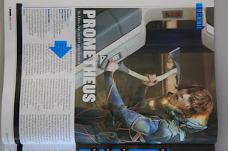
This is another double page spread that we have chosen for analysis for our media coursework and an example of a  double page spread that we can base our double page spread that we are going to create for our media coursework. This double page spread is taking from Empire magazine and this double page spread contains a review for the film Prometheus.

The target audience for this double page spread would be people who would like to watch the film Prometheus and are trying to find out what the film is actaully like and the review rating it got from Empire magazine. This double page spread also targets people who would like to see the film as well, because of the fact that the review of the film Prometheus would cointain spoliers to what actaully happens in the film and some of the best moments in the film that would attract people to go and watch the film. This double page spread also attract people who like the actors/actresses in the movie as well, for example in Prometheus some of the actors/actresses include Noomi Rapace, Charlize Theron and Guy Pearce. If audience members enjoy films with these actors/ actresses in then they are more likely to watch the film but also if they know there is a review for the film they are more likely to read the review that Empire gave the film and see what rating it got, so more people would read the double page spread. This is also true for the director for the film which in this case was Ridley Scott. If audience members enjoy films that he has made then they are more likely to see the film or even to read the double page spread review to find out more about Prometheus.

There are many codes and conventions that are used in the double page spread that make it effective to a reader of the magazine, for example The masthead which is an important code and convention to use for double page spreads becuase it helps to tell the readers what the article is about. The masthead is located on the left hand page of the double page spread and is written in white. Having the masthead written in white makes it stand out from the background, this means that the readers can easily see what the article is actually about. Also there is a main image which is also located on the left hand side page of the double page spread. The main image is important to use because it gives a clue to the readers what might happen in the film and what exactly to expect fromt the film as well, the main image is also a good way to try and sell the film as well, as it is the biggest image on the double page spread it stands out and would instantly grab the readers attention. The white background of the double page spread is white which does not draw the attention of the reader, and keeps the focus on the review on Prometheus, having a bright coloured background would draw the attention away from the review. The text is written in black which stands out from the white background. This makes it easier for the reader to read, The text is also written in coloums, this breaks all of the text up and makes it easier for the reader to read as it is not in one big paragraph, and it also makes the article look more proffesional and tidy. There is also a secondary image located on the right hand side page of the double page spread. This secondary image is used to give an idea to the feel of the film and also gives an inssight into what might actually be happening in the film also. There is also some text written in white on the image which gives an idea to what the picture is about and what relevence it could actaully have on the film as well. Also at the bottom there is a summary of the review and the rating that Empire magazine give the film. This is written in a bold font which help to stand out from the white background and also allows it to stand out from the rest of the text as well, this indicates that it is the summary, and an important part of the review of the film Prometheus.

This double page spread was taking out of a magazine called Empire. Empire is a British film magazine that contains information on the latest upcoming films, reviews of films past and present, Interviews with directors/actors, reviews of latest DVD releases, news from the set of upcoming films and much more. Empire magazine is released every month and is the most popular film magazine that is released in Britian. The editor of the magazine is called Mark Dinning. Empires top reviews and extensive material are the reason behind its success and its growing popularity.

Dan

Must Peeter Short film poster


The target audience for this poster would be young adults to people in there mid thirties because of the young man on the poster but also a niche audience of people who smoke. The angle of the man creates mystery and depth to the character that would attract the audience. The addition of the focus created on the cigarette connotes the possible stress of the character and also the age of the character.

The codes and conventions of the poster suggests that the character is possibly isolated and self driven; because you cant see the mans face fully this connotes a mysterious side of the character or possibly that the character does not want his face to be seen. The use of black and white adds the the mystery of the character and plot of the film however the white is used effectively to highlight the shapes of the mans face, clothes and the cigarette. The un-common spelling of Peeter stands out bold on the master head and against the black of the back ground. The font is simple as to not distract from the image but is also bold and eye catching. Leah

Empire Magazine Avatar Double page spread


This is one of the double page spreads that we have chosen for analysis for our double page spread that we will create for our double page spread for our short film that we will be creating. This double page spread is from Empire magazine and about the blockbuster film Avatar.


The target audience for the double page spread is targeting people who have enjoyed the film and people who are interested in watching the film called Avatar.  This also targets the readers of Empire magazine that would read this article when they are looking through the empire magazine. The target audience also could be to people who actually like the actors/actresses that are staring in the movie for example in this instance the stars would be Sam Worthington, Zoe Saldana, Sigourney Weaver. So if audience members enjoy films that these actors/actresses have been in they are more likely to go and watch avatar because of those actors/actresses. Also this would be the case for the director, for example the director of the film would of had follows or people who enjoy watching the films that he produces so people would see the film because they like the films that the director has made before in the past.

The double page spreads uses codes and conventions for example the double page spread contains a masthead in the middle of the left hand side page, this is used to advertise the film, and it also is used by Empire magazine to tell the readers of the magazine what the article is about, in this case the article is about the the film Avatar. Another code and conventions that is used in the article in Empire magazine would be that the text is written in columns, the fact that the text is written in columns makes it easier for the readers of the magazine to actually read the article, and it also make the article look professional and it makes it look tidier. Which in case makes the article look more professional. The double page spread contains one main image which is located on the right hand side page of the double page spread. The main image helps to show the readers of the magazine the characters that are in the new film, and what to expect from the film as well, the main image is a good way to try and sell the film as well. There is also a secondary image on the left hand page of the double page spread, this also is a chance to show the main cahracter in the film, apart from the secondary image that is located on the left hand side of the page there are also smaller images that are located on the bottom of the right hand side of the page as well, these are a selection of stills from the movie and they help to give an idea to the audience what the film is actually about and gives a sense of the plot of the movie. The text is written in white which helps the text to stand out from the dark background that Empire has chosen to use in this article. The colour of the text also makes it easier to read and means that it is quicker for the reader of the magazine to get the information they want from the article quickly. There is also a text box on the right hand page, this text box contains facts about the film, This text box has a orange background that stands out from the rest of the magazine double page spread. This makes the facts text box look more attractive and would make readers of the magazine interested as to what the facts are. This is also apparent on the masthead on the double page spread, the text box around the masthead helps to make the masthead stand out and try and grab the readers attention, which will make people read the magazine article about Avatar.

This article was made by Empire magazine. Empire magazine is a British film magazines that reviews films, contains latest news on upcoming films, interviews with directors/actors, film advertisments and more. The first issue of the magazine was released in July 1989. The editor of the magazine is called Mark Dinning and an edition of the magazine is released every month. Empire is the biggest selling film magazine in Britian.

Dan

Tuesday, 18 September 2012

Memories Short film

http://www.youtube.com/watch?v=85HDu87TGy0

Another short film that we have chosen for analysis is Memories. Memories is a award winning short film that has won awards in the nation student film festivals and other fetsivals that are of the similiar type. This short film follows the journey of an male character who finds film which shows parts of the characters life, he then follows the film until he reaches his home, in which he finds a book which contains pictures/ memories of his life, as the images fade out of the book the character is assumed to be dying.

This short film is targeted towards adults, this is because of the fact that it shows someone looking back on there life and looking back on key points in the characters life, and this relates to the targeted audiuence of the short film "Memories" because as you get older you tend to look back on your life, and reflect on the expierences that you have gone through in your life, This would not target a much younger audience because of the fact that younger people do not really look back on the things they have done they look to the future rather than looking back.

One of the codes and conventions that were used in the short film help to create an depressive feel as the male character looks back on his life and eventually assumed to have died at the end of the short film. Costume is used to show the age of the character, the clothes that he is wearing suggests that the character is an elderly character, for example the smart trousers and the jeacket that the character is wearing help to show is age. This can also relate to the idea of time passing and the character looking back at his past because it makes the representation of the character more believable. The use of props is also helpful, for example the use of the film which represents the characters life in the short film, this is also helpful because it shows some major events that happen in the characters life, using different film at different types in the short film help to represent the idea that time is passing and this his time is running out for him. Lighting was also important for example when the character is walking around there is the use of natural light, but when he looks at the film and the memories are shown with a filter effect which makes it look darker on screen. This also looks like how old movies would of been shown, This can be seen to represent that time is rapidly passing by and represents that the memories are far behind him in the past. The sound also plays an important part in the short film, for example the music starts half way thtough the short film and this helps to create a sad and depressed atmosphere which makes you think that something might happen to the character. The music could also represent how the character feels when he is looking back over the photos of his life.

Camera angles-


Long Shot- This is an example of a shot that is used in the short film 'Memories'. This type of shot if a long shot. There are a couple of long shots that are used in the short film. The long shot shows the character, the surrondings of the character and what the characters cotume. The long shot helps to show the costume of the character which tells us some information about the character and the age of the character that the film is being about. In this example the main character is wearing a jacket and smart trousers, this sterotypes the character as an elderly character this is beacsue of the fact that this is what elderly characters wear, and getting the correct sterotype for the character is important to make the character more believable which makes the short film believable.
 
 
Close up- This is another example of a shot that is used in the short film 'Memories'. This type of shot is called a close up, which is used to show the face of the character. This tells the audience information about the charcter for example his age, what he is wearing and what could be going on in the plot of the short film 'Memories'. The close up in this case is mainly used to show the agae of the character, this close up tells us that the character is elderly and this shot also is used to show that the character is holding some film, which could indicate to the audience what the plot of the short film will be.


High angle/over the shoulder shot- This is another type of shot that is used in the short film 'Memories'. This shot is a combination of a high angle shot which is why the camera is looking down at the action and a over the shoulder shot which why we are looking over the characters shoulder to see the memories book. This shot is used to see what the chracter is looking at, which in this case is a book full of the main characters memories. This is helpful as it tells the audience a bit more about the character and what the character might be going through. This also gives us an idea on the back story of the main character as we are seeing images of his past, and the shots that follow this shot tells us the life expierences that the character went through.


Extreme close up- This is another type of shot that is used in the short film 'Memories. This shot is an extreme close up, unlike the close ups that were used in the short film, this extreme close up just focuses on the characters eyes rather than the characters whole face. This indicates to the audience the age of the chacter, for example this shot shows the wrinkles around the character eyes which indicates to the audience that the character is elderly. These shots are very effective and for us it stood out from the other shots becuase it makes you realise how old the character is, and is more effective than using the close up to show the whole of the characters face.

Editing- At the beginning of the short film the pace of editing is slow which gives the audience time to get to know the character and the situation that the character is in. The slow pace of editing gives the short film a depressive feel to the film and might give a slight hint to what might happen towards the end of the film, The pace of editing changes towards the end of the short film,when the character is looking through his book of memories and when the character is dying, the pace of editing suddenly becomes quicker which shows his life passing and ending, it also is used to show some of his memories flowing from one memory to another. Cross cutting is also used in the short film, for example when the charcater is collecting film, cross cutting is then used to cut to shots of the main characters memories and the charactes past. This is effective as it shows the character in the present and in the past. Also fade ins where used in the short film aswell, the fade ins where used when the character is collecting the film which represents the character collecting his memories. The fade in where effective as it shows his journey quickly without having to do multiple cuts they can just fade in new sequences into the orignal sequence which continues the story more effectively than it would of done by using just a straight foward cut of the footage.

The short film "Memories" was directed by Radoslaw Sienski, The short film was directed, written and edited by Radoslaw Sienski. This short film was created by a student, "Memories has been distributed around the world using the video sharing website called YouTube which has been uploaded to the website and distributed around the world. The cast for the short film included four actors called Andrew Bolton, Tom Bolton, Vicky Bolton and Thea Bolton.

Dan


Education for Leisure short film


 Education for Leisure has won two awards, one at the Coca-Cola Cinemagic Film Festival 2010 and also the No limits award at the No Limits Film Festival in 2011. The film is inspired by a poem by Carol Ann Duffy and follows the day of a boy who is bothered by everything in his life but highlights the difference the small things make in life. This multi award winning short film targets both a teenage and adult audience; although the teenage audience will be larger because of the age range of the majority of characters in the film also a small adult audience would be formed by the roll the mother of the boy has in the film. The clothes and settings of the production target a modern audience and also most society classes.

 The codes and conventions of the production suggest the mental distress the boy feels and the pressure the world has on him, this is connoted when the boy is standing in the shower letting the water run over his head; this classic scene is associated with someone being in a stressful situation and finding some sort of escape through the running water.
The costume of the main character suggests a very laid back attitude towards rules and regulations of school policy as he has a dark coloured hoodie over the top of his school jumper and the laid back attitude is also connoted by the lowness of his bag. The dark colours the boy wears through out the film connote a mystery and depth to the character and as dark colours are associated with negative feelings this is also linked to the character. The big house and remoteness of the property connote wealth however seclusion from the outside world which also links to the characters own self seclusion.
 The music starts instantly after the boy is nearly knocked over by an on coming car, the music is slow and solum therefore connotes no panic or bother in the boy that he nearly got hurt which again links to his state of mind. A lot of the film is based a cruelness and killing of animals from the boy which may connote a deep hate for humanity and the world especially when he feels like a 'superstar' after murdering a girl.
Slow and fast motion is used in the film when the boy is walking through the school and around his house to show the detachment the boy feels from the world of reality.The most important connotation in the film is when time reverses right up to the point in the morning when the boys mother is leaving the house and instead of just leaving she goes up stairs wishes her son a good day; highlighting the importance of the little things in life however exaggerated the end circumstances may be.

An extreme close up is used at the beginning of the short film as the boy is waking up, this puts the audience immediatly in contact with the character and also makes the audience slightly disorientated because they dont know what is going on in the scene or the setting.


In this shot the camera is held at a tilt, this is an interesting angle for the audience to view as it almost suggests, because its such an abnormal view point, that we are looking in on something that isnt supposed or neccesserily viewed.


A low angle is used in the short film to create shading across the characters face to make him seem more domniating and suggest that his chracter is in power over the situation.


An over the shoulder shot is used when the boy is following the girl, this way the audience sees the reaction of the girl via her facial expressions but also connotes the fear of the boy speeding up behind her. This puts the audience in the position of the girl, of whom we know nothing about ad makes the audience connect with her.


Editing is used uniquely in this short film, slow motion is used frequently throughout, this creates suspense and puts the audience on edge. At the end of the short film some scenes are reversed to show time going back to the ealier morning when the boys mother is leaving, this connotes not only the time movement but also the butterfly effect of the whole film.

Sound is used very effectively in this short film. From the sound of the bed creaking to the crunch of the boys toast mostly every sound in the opening few minutes is amplified and made louder; this creates a the scenes slightly surreal however also makes the audience focus on the actions of the boy rather then the charcter himself which is a useful connection to be made at the start of the short film because of what comes later. Music is also played during the title sequence as the boy makes his way to school, this helps create interest to the scene and keeps the audience engaged.
Foreshadowing is created with sound when the boy makes the flip book of someone being murdered and you hear the stab of flesh and a girl screaming.

 The directer, writer, editor and producer of Education for Leisure is an award winning 18 year old film maker called Dan Allen. He has his own website and has an archive of short films and awards to his name. He started out producing his first film in senior school and then went on to enter film festivals and other award winning schemes. He also has funding from the BFI.

Leah Brine

The Plan short film

The Plan http://www.youtube.com/watch?v=3OGX8iYBBCE&feature=related

The Plan is a short film about a man putting everything he has in his life on red at a Las Vegas casino. His mission is to go back to the days when life was easy and things happened by chance and to find a new love in his life.

The codes and connotations of the short film suggest a modern day setting with parts of the past leaking through. A central object of the short film is the mans vintage camera that prints onto film instead of being digital; this object records his journey until it is stolen by a mysterious woman. The costume of the man suggests a laid back character with an average income; his phone however also has the same amount of screen time as his camera as it has the opposite message to convey; while his camera represents the freedom of his past, his phone represents the restriction of his present and possible future because of the constant calls from his girlfriend. The props used in the film such as the camera and the phone have an important role to play in the film as well as the mains small over night bag "filled with the essentials of survival" which help to show some humor in the character. The setting connotes freedom as he travels down a highway, the open spaces and mass of sky connote this also. The setting changes when the man meets the women and she steals his camera; trucks are parked in the open space, clouding his view of the woman and threatens to send him back to the modern world he is so desperate to get away from.

A long shot is used to show the man walking away from the camera towards the bank, this puts an emphasis on where he is going and not where he has come from at this point because the money is a very important part of the story and it is established in this shot.


A mid shot is used to highlight certain points of the mans newly found freedom, one is in the car when he is singing along to his radio. The mid-shot focus's the audience on the man and his actions rather then the cars outside.


Close-ups are used in the film to show the man enjoying his journey and taking in the surroundings and gives the audience a chance to see the mans face a bit clearer at this point of the film for a longer take.


An over the shoulder shot is used when the characters girlfriend is calling on the phone; the shot puts the audience in the position of the character and makes the audience either relate to a simiular experience they have had or sympathise with the character. This adds to the relationship between the audience and the character.


Another shot of the character involved the camera spinning around him in a moment of panic and frustration when his camera is stolen. This involves the audience in the fast of movement of the scene but also the head spinning frustration of the character. The type of shot not only adds to the intensity of the scene but allows the audience to see the entire surrounding area of the charcater which adds to the reality of the situation.


An Extreme close up is used when the lady hands the man his chips for the roulette table, this connotes the importance of the chips and the part they have to play in the up and coming scenes.


The entirety of the short film has been made black and white; this could connote many different things about the character and the situation. The black and white filter could connote the characters life that is still haunting him as it was not the life he wanted and may have drained his living of colour. Another reason for making the film black and white could be so that the audience dont focus too much on colour and dont get distracted by it but instead focus on the image. The varity of shots used espically in the montage of the man getting ready help move time along and show more of the characters experiences.
Slow motion is used as the man approaches the casino and throughout the scene as he bets on red and loses. This heightens the tension of the scene and makes it go a painfully slow for the audience to build anticipation. Throughout the slowmotion used on the betting table you see no people apart from the dealers hands to completely focus the audience on the table and nothing else.

Music is used throughout the film and heightens when the camera is stolen and when the man sees the picture of himself on the wall. Other sounds such as the ringing of the phone is quite piercing and is used to unsettle not only the character but also the audience. During the slow motion casino scenes a loud drawn out bell sound helps build tension for the audience and only stops when the game is over. Voice overs are used mostly in the film to connote the characters inner thoughts and feelings and is used effectively when the man is packing for his long journey to emphasize what is going on.

The target audience for this short film would range from modern young adults to adults maybe reaching the peek of middle age. This range would form as the young adults would recognize the modern setting, clothes and props whereas the storyline of adventure and escaping may appeal to older adults. The connotations created by the props would also appeal to middle aged people as the camera and old western style shack may remind them of places, movies and items they might of owned years before or maybe a lost passion.

The film was written, directed and produced by Matthew Kalish who is a 33 year old short film and video maker from New York. The film has been rated 6.1 on IMBD and follows a list of other successful short films produced by Kalish.

Leah Brine

Thirst short film

http://www.youtube.com/watch?v=ck0028dgUmA

Another short film that we decided for analysis is "Thirst", "Thirst" is a short film about a guy who is transported to the desert every time he touches water, for example when he takes a drink of water he is transported to the desert and the water that he is drinking has actually turned to sand. This also happens when he jumps into a swimming pool, he is then transported to the desert again. This short film has comedy touches which enlighten the mood of the short film.

This Short film was produced/directed by Keith Rivers and was written by Keith Rivers and Clark Koelsch. This short film had a lof of different crew that helped to create the short film, for example from directors of photography to music compositors to field audio and location scouts. The short film "Thirst" had a cast of five people these were Clark Koelsch (producer/director), Matt Yoakum, Rebecca Zamolo, Peanut who was the miniature Pincher and Chris Mceuen. The short film "Thirst" was a Doorpost Film Project in 2010.

The target audience for this short film would mainly be adults who enjoy the kind of humour that is being used in the short film "Thirst", The target audience is most likely to be adults rather than young people because of the fact that Young people might not understand the humour that is being used in the short film, and they might not enjoy how it keeps repeating its self throughout the short film. Adults are more likely to enjoy this kind of humour and they are more likely to enjoy how the story keeps repeating its self and the humour that this actually creates in the short film "Thirst".

The codes and conventions that are used in the short film help to give the short film a comedic edge to the short film. For example The costumes that are used are to help identify to the audience the age group of the characters that are being shown in the short film. For example in the short film the characters are wearing casual comfy clothes that people would be seen to be wearing now a days. This is indicates to the audience that they are young adults because this is what young adults would be wearing. The lighting is also important, the lighting in the short film helps to create the desert atmosphere which helps to make the locations more believable, as they also are using natural light to film in for example in the desert scenes. This also makes the location more believable because it is stereotyped that in a desert location there is lots of sun and natural light. the sound that is used in the short film help to create the desert also it also stereotypes western kind of music from western films that where made. This helps to create a stereotypical western setting in the short film. Which adds to the comedy to the short film "Thirst" because it is not a typical western short film which makes it seem like the character is alienated from the surroundings which it makes more comedic for the audience to watch. the camera angles also help to create the comedic feel to the short film for example the shots of the landscape around the main character help to create the feel of alienation for the character, also the high angle shot looking down on the character face as he walks through the desert, this helps to show the comedy as the character is struggling to walk through the desert,

(High angle shot-looking down on characters face)
(Shots of character with desert surrondings)
 
 Also the shots when the character is underwater help to show how happy he is to see water and shows it in a comedic way for example the characters facial expressions help to create the comedic feel to the piece. these kind of shorts also help to build up the comedic approach to the short film because you instantly know when he touches the water he is transported to the desert again. Also the long shot at the end with the girl character is also comedic as she in the previous shots ignored the main male character but then she is then transported to the desert when she drinks out of the bottle of water.


                                             (Shot of main character underwater)


                                           (Long shot of girl in desert)


Editing- At the beginning of the short film the pace of editing is slow, for example when there is establishing shots of the surronding desert, the pace of editing is slow so that the audience know exactly where the short film is based and the isolation of the setting of the short film as well. The pace of editing does not really change throughout the short film 'Thirst', this is effective as you get to understand what the character is going for example in the film it is the fact that when the main character has a drink of the water he is transported to the desert. This also builds up the comedic value of the short film as well because you know exactly what is going to happen to the characer. Cross cutting is used when the main character has a drink the shot is cut so the main character is transported to the desert, the cross cutting in the short film is very effective because you know what is coming before the cross cutting is actually used. They also use fade ins when the main character is in the swimming pool, this is used to show how happy the character is when he is in the swimming pool. The fade ins look effective and work better in this scenerio as using normal cuts would proberly not work as well in the pool scene.

sound - Sound is used effectively in the short film for example the is sound playing in the background of the short film which helps to create an atmosphere and helps to show the isolation of the character as well. Dialogue is also used, this is used to show what the character is going through and how annoying it must be to not be able to drink water, and if you did drink some water being transported to the desert. Ambient sound is also used this is used as the desert sounds, this makes the desert come to life and makes it alot more believable and releastic as a audience member watching the short film. This is used in multiple scenes for example when the tumble weed is going across the screen or when the main character jumps into the swimming pool near the end of the short film.


Dan

Purge poster


This is another short film poster that we have chosen for analysis. This is a short film poster for the film "Purge". "Purge" was a short film in 2008 which was written and directed by Brad Kammlah. This short film has won awards and has been shown at alot of film festivals in America. The film is about a girl who was abused by her father, but her Mother does not believe her, so she has to find her own way out of the situation.

The target audience for this film is narrowed down compared to most short film, as this is an extremly upsetting and emotional topic to actually show, and has it is a hrad subject to discuss the target audience for the film is narrowed down. The target audience for the short film is proberly for people who have been in the same situation that the main character is in and that they can relate to the character and her struggle trying to get out of the situation that she is in. But this could also target people who do not know much about this upsetting and emotional topic and want to know about the topic and how this character managed to try and find a way out of the situation and away from her abusive father.

The masthead for the poster is located in the middle of the poster. The masthead is written in white which stands out from the background, but it does not take the attention away from the main image which is located right next to the masthead. The masthead does not use fancy writting as this is not right for the topic that the film covers. The writting is more plain and is more suttle, which is more relevent to the topic of the short film. The main image is located next to the masthead, The main image is of half of the main characters face. The upsetting look on the main characters face indicates that this is going to be an emotional short film and may be upsetting for some audience members, just the fact that only half of her face is showing indicates that maybe after all the years of abuse she is only half a person, because the other half of that person has been ruined by the years of abuse from her father. The main image is the main focus of the poster and stands out from the background and the masthead. This means that she is the main theme of the film and that the focus will mainly be on her throughout the film. The background on the poster for the short film "Purge" has been blured out, this indicates that nothing else is really important apart from the fact that this main character has to escape from being abused and to try and get her mum to believe her. This also makes the main image and the masthead stand out more as the first thing you would see would be the main image and then the masthead. There is also some text at the bottom of the poster which has details about the crew for example directors, actors ect, even this is suttle and does not take the attention away from the main character herself. The text is written in white which stands out from the background but is less suttle than the masthad.

The short film "Purge" was directed and written by Brad Kammlah, The film starred Danielle Hagan, Mark Arnold and Mary McNeill. The cinematography for the film was done by Gigi Malavasi. The short film was distributed by Take Flight Films and Take Flight Films was also the production company for the short film as well. "Purge" has apperead at many film festivals for example LA shorts fest, Mammoth Film Festival and the playhouse west film festival just to name a few, but it has also won awards such as best dramatic short, Best score in a short film and the honorable mention best short drama.

Dan