Tuesday, 25 September 2012

Questionnaire Results


1. What is your gender?

The results of our questionnaire show that we asked equally both male and females which makes our results more reliable as there is no dominance of either gender. The importance of this effects our results as mostly men enjoy action films whereas woman tend to enjoy comedy and romance more therefore by having an equal audience representaion of both genders our results are more like to be accuarate.


2. What is your age?

Our results concerning age are dominated by audience members who are between the ages of 16-18 and a minority of one person for both age ranges of 19-21 and 22+. However the dominnance of the 16-18 year olds in our questionnaire is very useful to us as 18 years old is the minimum age of the audience we are trying to target (18-25). The majority of students who selected 16-18 years of age are eighteen or will be turning eighteen in a few months therefore doesnt effect the overall accuracy of our questionnaire.


3. Have you seen a short film?

Our questionnaire revealed that all of our audience members have seen at least one or more short films in their life, this is a good result to have collected as it tells us that there is still an interest in our target audience age range for short films and that the market for that is still there. This is also useful as our audience will have a better idea of what makes a good short film and what they might expect from it because the content and layout of a short film can be very different from that of an hour long blockbuster with a distinguished cast or director; as most short films are ameuture or do not get further then youtube.


4. What genre of film do you like?

The results of this question in our questionnaire show clearly that there is a near even spilt between comedy, action, romance and sci fi. This connotes that our audience prefer something with depth or fast pace to keep their attention and put them on the edge of their seat. The presence of comedy and romance in the results also show that our target audience also like to relax and enjoy a film and get lost in the characters. Another important result is that Horror films were not prefered by any member of our target audience; this shows us that although there may be a market for the genre it is the one with less impact and is not preferrably watched by our target audience.


5. How often do you watch films a week?

The results for this question show us that six out of 10 people watch films 2-3 times a week, two people watch films rarely a week and 2 watch films every day. This shows us that films are still an important part of our target audiences life and that they regularly watch them. This is useful knowledge of our target audience as it shows that our audience have probably viewed a lot of different films that have different takes on ideas, situations and characters; which means our target audience will be more open to new material and ideas.


6. What's one of your favorite films that you have watched recently?

The results from this question range widely as the answer was the open opinion of our audience members and they are all different. The results are split 4 and 6; six people enjoyed recent films such as The Dark Knight Rises, The Hunger Games and Avengers while the other four prefered older films like Forrest Gump and Kick Ass. This shows us that our target audience is open to old and new productions as long as they are done to a certain standard; the more modern films are full of action and complex story lines whereas the older films such as Forrest Gump have a depth of character that the audience love.

7. What poster are you attracted to the most?


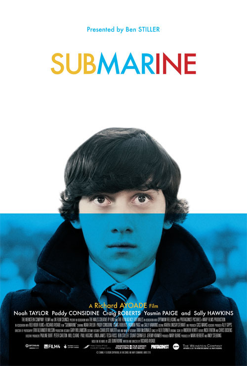
(Poster A=Purge, Poster B=Star Trek, Poster C=Submarine)


The results of this question show us that 50% of our audience prefered the poster for the independant film Submarine whereas 20% prefered the poster for Purge and 30% the poster for Star Trek. The importance of this question was that it didnt matter if the audience enjoyed the film, it was what poster they were most attracted to and this information will help us when we come to make our poster for our short film.

8. What aspects of the poster did you like?

The majority of our audience prefered the poster for Submarine (shown in the results for question 7) and most comment that they liked the simplicity of the colours used on the poster, the clear and slightly comical image of the main character on the poster and also the effective artistic simplicity of the poster. The 30% who prefered the Star Trek poster liked the blurred shape of the space craft and commented that the moevement of the image makes the poster more intense. The 20% who prefered the poster for Purge like the use of depth of field on the poster, the layout and text font but also commented that because you can only see half of her face it makes the image more interesting.


9. What makes you go to see a film?

The results for this question shows us that 50% of our target audience go to see films because of the cast that are in the film, 40% go for the plot line and 10% go to see a film because of the director. These results show us that cast are important in the making of films however a good chunk of our target audience are still likely to see films even if their favourite actor isnt present as long as the story line is gripping. The 10% that would go to see a film for the director is intersting because it means that the role of the director is still very important and has an impact on the audience still.


10. What media platforms do you watch films on?

The results of this question show us that 40% of our target audience watch films on DVD while 30% watch films on a computer, compared to 20% who go to the cinema and 10% chose other and specified that they watch movies in their home cinema; because a good percentage of our audience members watch films on their computers (possibly on youtube or on movie websites) this shows us that there is a connection that can be made to our target audience. Also the fact that there were no results for our audience watching films on TV shows us were we are most likely to get in contact with our target audience.

(Dan = Pie charts and post layout, Leah = Analysis)

Wednesday, 19 September 2012

Empire Dredd double page spread


The target audience for this double page spread would be the same for the film that it is reviewing; Empire has a wide audience range of 16-35 year olds who are film enthusiasts. The target audience would be interested in a range of different films as Empire Reviews and advertises films from a range of genres.

The layout of the double page spread puts focus on the picture from the film and catches the readers attention with the characters unusual costrume. The large bold text of the title of the film on the left hand side of the double page spread is clear and in capital letters to grab the someone who may just be flicking through the magazine in a shop. The text goes down in three columns and splits into smaller sections to highlight the key information of the film. Blue is used throughout the the spread to higlight information; blue connotes the idea of space and possibly a space theme through out the film as it also contrasts with the black and dark red of the characters costume. The costume of the character covers his eyes which connotes a mystery to the character but also hides the identity of the actor beneath which may be appealing to the audience as it may give away hints to the story line of the film. The Look Closer box on the picture shows four different points about the film that may be interesting for the audience and gives the audience a slight edge on the general public who may not know that information about the film and may be the hook and tease for the film.

Empire is an established movie magazine that targets a large audience, the magazine contains inforamtion on new films coming out, interviews with famous actors/directors, latest movie news, reviews of films, latest DVD release and much more, an issue of Empire magazine is released every month, sometimes there are special editions of Empire for example this year there have been a blockbuster special and 'The Hobbit' special. The editor of Empire magazine is called Mark Dinning. Empire is probelry one of the most popular film magazine that are available to buy in the UK.

Leah Brine

Empire double page spread


This is another double page spread that we have chosen for analysis. This double page is an interview with two cast members of the upcoming film 'The Campaign' starring the likes of Will Ferrell and Zach Galifianakis. This double page spread is taken out of Empire magazine, which is a film magazine that is released every month in the UK. This double page spread would target people who are intrested in the film, or even people who have enjoyed the trailer for the film as well. This double page spread also targets people who enjoy watching films that contain the likes of Will Ferrell and Zach Galigianakis, if audience members enjoy films that these actors have been in before they are more likely to watch the film and they are also more likely to read the interview with the stars of the film. This is also the same for the director of the film as well, because if they like any films that the director has made in the past they are more likely to see the film and read the article to find out more about the film.

The codes and conventions that are used in the double page spread from Empire magazine help the article to stand out from the rest of the content that is in the magazine. The masthead for the double page spread is located on the left hand page of the double page spread. The masthead is written in yellow and in a bold font that makes it stand out from the main image. As the text is written in yellow and is in a bold format it stands out and grabs the attention of the reader of the magazine as they look through the magazine, this means that they are more likely to read the article. The main image is located on both pages of the double page spread and acts as the background for the interview as well. As the main image is of the two main characters in the film it helps to give a feel to the film and helps to tell people what the film might be about, as the main characters are the main image, it will attract people who like the attracts becasue the picture is large and stands out and will attract the readers of Empire magazine to read the interview with the stars of the film. The text on the double page spread is written in black which stands out from the white background, this makes it easier for the readers to read the text and it stands out so it will grab the attention of the targeted audience. Also the text is written in columns which breaks up the text, this is important as it makes the interview easier for the audience to read, this is also important because as the text is broken up it does not look off putting to read where as a big chunk of text can be off putting so the reader would not want to read the large amount ot text. The questions that Empire magazine are asking the stars of the film are written in a bolder font, this makes sure that the audience can seperate the questions from the answers that the stars are giving. This makes the innterview look better and would stand a greater chance of standing out nad grabbing the attention of the target audience.

Empire is a film magazine, that contains information on upcoming films, latest news on production of films, interviews with famous actors/directors, reviews of latest films, latest DVD releases. The film magazine was first published in July 1989. The editor of Empire magazine is Mark Dinning and is released every month. Empire is one of the most popular film magazines in the UK. Empire have there own webistes which also contains information on upcoming films and movie news, and also contains information on the latest issue of the magazine and future issues of the magazine as well.

Dan


Empire, Prometheus double page spread


This is another double page spread that we have chosen for analysis for our media coursework and an example of a  double page spread that we can base our double page spread that we are going to create for our media coursework. This double page spread is taking from Empire magazine and this double page spread contains a review for the film Prometheus.

The target audience for this double page spread would be people who would like to watch the film Prometheus and are trying to find out what the film is actaully like and the review rating it got from Empire magazine. This double page spread also targets people who would like to see the film as well, because of the fact that the review of the film Prometheus would cointain spoliers to what actaully happens in the film and some of the best moments in the film that would attract people to go and watch the film. This double page spread also attract people who like the actors/actresses in the movie as well, for example in Prometheus some of the actors/actresses include Noomi Rapace, Charlize Theron and Guy Pearce. If audience members enjoy films with these actors/ actresses in then they are more likely to watch the film but also if they know there is a review for the film they are more likely to read the review that Empire gave the film and see what rating it got, so more people would read the double page spread. This is also true for the director for the film which in this case was Ridley Scott. If audience members enjoy films that he has made then they are more likely to see the film or even to read the double page spread review to find out more about Prometheus.

There are many codes and conventions that are used in the double page spread that make it effective to a reader of the magazine, for example The masthead which is an important code and convention to use for double page spreads becuase it helps to tell the readers what the article is about. The masthead is located on the left hand page of the double page spread and is written in white. Having the masthead written in white makes it stand out from the background, this means that the readers can easily see what the article is actually about. Also there is a main image which is also located on the left hand side page of the double page spread. The main image is important to use because it gives a clue to the readers what might happen in the film and what exactly to expect fromt the film as well, the main image is also a good way to try and sell the film as well, as it is the biggest image on the double page spread it stands out and would instantly grab the readers attention. The white background of the double page spread is white which does not draw the attention of the reader, and keeps the focus on the review on Prometheus, having a bright coloured background would draw the attention away from the review. The text is written in black which stands out from the white background. This makes it easier for the reader to read, The text is also written in coloums, this breaks all of the text up and makes it easier for the reader to read as it is not in one big paragraph, and it also makes the article look more proffesional and tidy. There is also a secondary image located on the right hand side page of the double page spread. This secondary image is used to give an idea to the feel of the film and also gives an inssight into what might actually be happening in the film also. There is also some text written in white on the image which gives an idea to what the picture is about and what relevence it could actaully have on the film as well. Also at the bottom there is a summary of the review and the rating that Empire magazine give the film. This is written in a bold font which help to stand out from the white background and also allows it to stand out from the rest of the text as well, this indicates that it is the summary, and an important part of the review of the film Prometheus.

This double page spread was taking out of a magazine called Empire. Empire is a British film magazine that contains information on the latest upcoming films, reviews of films past and present, Interviews with directors/actors, reviews of latest DVD releases, news from the set of upcoming films and much more. Empire magazine is released every month and is the most popular film magazine that is released in Britian. The editor of the magazine is called Mark Dinning. Empires top reviews and extensive material are the reason behind its success and its growing popularity.

Dan

Must Peeter Short film poster


The target audience for this poster would be young adults to people in there mid thirties because of the young man on the poster but also a niche audience of people who smoke. The angle of the man creates mystery and depth to the character that would attract the audience. The addition of the focus created on the cigarette connotes the possible stress of the character and also the age of the character.

The codes and conventions of the poster suggests that the character is possibly isolated and self driven; because you cant see the mans face fully this connotes a mysterious side of the character or possibly that the character does not want his face to be seen. The use of black and white adds the the mystery of the character and plot of the film however the white is used effectively to highlight the shapes of the mans face, clothes and the cigarette. The un-common spelling of Peeter stands out bold on the master head and against the black of the back ground. The font is simple as to not distract from the image but is also bold and eye catching. Leah

Empire Magazine Avatar Double page spread


This is one of the double page spreads that we have chosen for analysis for our double page spread that we will create for our double page spread for our short film that we will be creating. This double page spread is from Empire magazine and about the blockbuster film Avatar.


The target audience for the double page spread is targeting people who have enjoyed the film and people who are interested in watching the film called Avatar.  This also targets the readers of Empire magazine that would read this article when they are looking through the empire magazine. The target audience also could be to people who actually like the actors/actresses that are staring in the movie for example in this instance the stars would be Sam Worthington, Zoe Saldana, Sigourney Weaver. So if audience members enjoy films that these actors/actresses have been in they are more likely to go and watch avatar because of those actors/actresses. Also this would be the case for the director, for example the director of the film would of had follows or people who enjoy watching the films that he produces so people would see the film because they like the films that the director has made before in the past.

The double page spreads uses codes and conventions for example the double page spread contains a masthead in the middle of the left hand side page, this is used to advertise the film, and it also is used by Empire magazine to tell the readers of the magazine what the article is about, in this case the article is about the the film Avatar. Another code and conventions that is used in the article in Empire magazine would be that the text is written in columns, the fact that the text is written in columns makes it easier for the readers of the magazine to actually read the article, and it also make the article look professional and it makes it look tidier. Which in case makes the article look more professional. The double page spread contains one main image which is located on the right hand side page of the double page spread. The main image helps to show the readers of the magazine the characters that are in the new film, and what to expect from the film as well, the main image is a good way to try and sell the film as well. There is also a secondary image on the left hand page of the double page spread, this also is a chance to show the main cahracter in the film, apart from the secondary image that is located on the left hand side of the page there are also smaller images that are located on the bottom of the right hand side of the page as well, these are a selection of stills from the movie and they help to give an idea to the audience what the film is actually about and gives a sense of the plot of the movie. The text is written in white which helps the text to stand out from the dark background that Empire has chosen to use in this article. The colour of the text also makes it easier to read and means that it is quicker for the reader of the magazine to get the information they want from the article quickly. There is also a text box on the right hand page, this text box contains facts about the film, This text box has a orange background that stands out from the rest of the magazine double page spread. This makes the facts text box look more attractive and would make readers of the magazine interested as to what the facts are. This is also apparent on the masthead on the double page spread, the text box around the masthead helps to make the masthead stand out and try and grab the readers attention, which will make people read the magazine article about Avatar.

This article was made by Empire magazine. Empire magazine is a British film magazines that reviews films, contains latest news on upcoming films, interviews with directors/actors, film advertisments and more. The first issue of the magazine was released in July 1989. The editor of the magazine is called Mark Dinning and an edition of the magazine is released every month. Empire is the biggest selling film magazine in Britian.

Dan

Tuesday, 18 September 2012

Memories Short film

http://www.youtube.com/watch?v=85HDu87TGy0

Another short film that we have chosen for analysis is Memories. Memories is a award winning short film that has won awards in the nation student film festivals and other fetsivals that are of the similiar type. This short film follows the journey of an male character who finds film which shows parts of the characters life, he then follows the film until he reaches his home, in which he finds a book which contains pictures/ memories of his life, as the images fade out of the book the character is assumed to be dying.

This short film is targeted towards adults, this is because of the fact that it shows someone looking back on there life and looking back on key points in the characters life, and this relates to the targeted audiuence of the short film "Memories" because as you get older you tend to look back on your life, and reflect on the expierences that you have gone through in your life, This would not target a much younger audience because of the fact that younger people do not really look back on the things they have done they look to the future rather than looking back.

One of the codes and conventions that were used in the short film help to create an depressive feel as the male character looks back on his life and eventually assumed to have died at the end of the short film. Costume is used to show the age of the character, the clothes that he is wearing suggests that the character is an elderly character, for example the smart trousers and the jeacket that the character is wearing help to show is age. This can also relate to the idea of time passing and the character looking back at his past because it makes the representation of the character more believable. The use of props is also helpful, for example the use of the film which represents the characters life in the short film, this is also helpful because it shows some major events that happen in the characters life, using different film at different types in the short film help to represent the idea that time is passing and this his time is running out for him. Lighting was also important for example when the character is walking around there is the use of natural light, but when he looks at the film and the memories are shown with a filter effect which makes it look darker on screen. This also looks like how old movies would of been shown, This can be seen to represent that time is rapidly passing by and represents that the memories are far behind him in the past. The sound also plays an important part in the short film, for example the music starts half way thtough the short film and this helps to create a sad and depressed atmosphere which makes you think that something might happen to the character. The music could also represent how the character feels when he is looking back over the photos of his life.

Camera angles-


Long Shot- This is an example of a shot that is used in the short film 'Memories'. This type of shot if a long shot. There are a couple of long shots that are used in the short film. The long shot shows the character, the surrondings of the character and what the characters cotume. The long shot helps to show the costume of the character which tells us some information about the character and the age of the character that the film is being about. In this example the main character is wearing a jacket and smart trousers, this sterotypes the character as an elderly character this is beacsue of the fact that this is what elderly characters wear, and getting the correct sterotype for the character is important to make the character more believable which makes the short film believable.
 
 
Close up- This is another example of a shot that is used in the short film 'Memories'. This type of shot is called a close up, which is used to show the face of the character. This tells the audience information about the charcter for example his age, what he is wearing and what could be going on in the plot of the short film 'Memories'. The close up in this case is mainly used to show the agae of the character, this close up tells us that the character is elderly and this shot also is used to show that the character is holding some film, which could indicate to the audience what the plot of the short film will be.


High angle/over the shoulder shot- This is another type of shot that is used in the short film 'Memories'. This shot is a combination of a high angle shot which is why the camera is looking down at the action and a over the shoulder shot which why we are looking over the characters shoulder to see the memories book. This shot is used to see what the chracter is looking at, which in this case is a book full of the main characters memories. This is helpful as it tells the audience a bit more about the character and what the character might be going through. This also gives us an idea on the back story of the main character as we are seeing images of his past, and the shots that follow this shot tells us the life expierences that the character went through.


Extreme close up- This is another type of shot that is used in the short film 'Memories. This shot is an extreme close up, unlike the close ups that were used in the short film, this extreme close up just focuses on the characters eyes rather than the characters whole face. This indicates to the audience the age of the chacter, for example this shot shows the wrinkles around the character eyes which indicates to the audience that the character is elderly. These shots are very effective and for us it stood out from the other shots becuase it makes you realise how old the character is, and is more effective than using the close up to show the whole of the characters face.

Editing- At the beginning of the short film the pace of editing is slow which gives the audience time to get to know the character and the situation that the character is in. The slow pace of editing gives the short film a depressive feel to the film and might give a slight hint to what might happen towards the end of the film, The pace of editing changes towards the end of the short film,when the character is looking through his book of memories and when the character is dying, the pace of editing suddenly becomes quicker which shows his life passing and ending, it also is used to show some of his memories flowing from one memory to another. Cross cutting is also used in the short film, for example when the charcater is collecting film, cross cutting is then used to cut to shots of the main characters memories and the charactes past. This is effective as it shows the character in the present and in the past. Also fade ins where used in the short film aswell, the fade ins where used when the character is collecting the film which represents the character collecting his memories. The fade in where effective as it shows his journey quickly without having to do multiple cuts they can just fade in new sequences into the orignal sequence which continues the story more effectively than it would of done by using just a straight foward cut of the footage.

The short film "Memories" was directed by Radoslaw Sienski, The short film was directed, written and edited by Radoslaw Sienski. This short film was created by a student, "Memories has been distributed around the world using the video sharing website called YouTube which has been uploaded to the website and distributed around the world. The cast for the short film included four actors called Andrew Bolton, Tom Bolton, Vicky Bolton and Thea Bolton.

Dan